Making Sense of the Covid-19 Pandemic Using Power BI

Like many of us, Centific’s own Data Strategy Director, Joe Thomas, longed to make a contribution to society by helping keep us informed of how each country going through the Covid-19 pandemic as faring against others.
IN HIS OWN WORDS
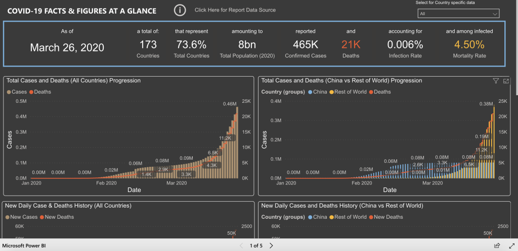
“The lack of detailed analysis options beyond reporting of numbers alone is what prompted me to embark on this journey of preparing a comprehensive dashboard that attempts to paint the full story from the origination in Wuhan China, to its abatement and pick up around the world.
I hope this dashboard (built on PowerBI and intended to be refreshed daily from its sources) will serve to shed a light on the gravity and reality of the situation through a more detailed and informed representation of data.”
INTERACT DIRECTLY WITH THE DASHBOARD
HOW TO USE THE DASHBOARD
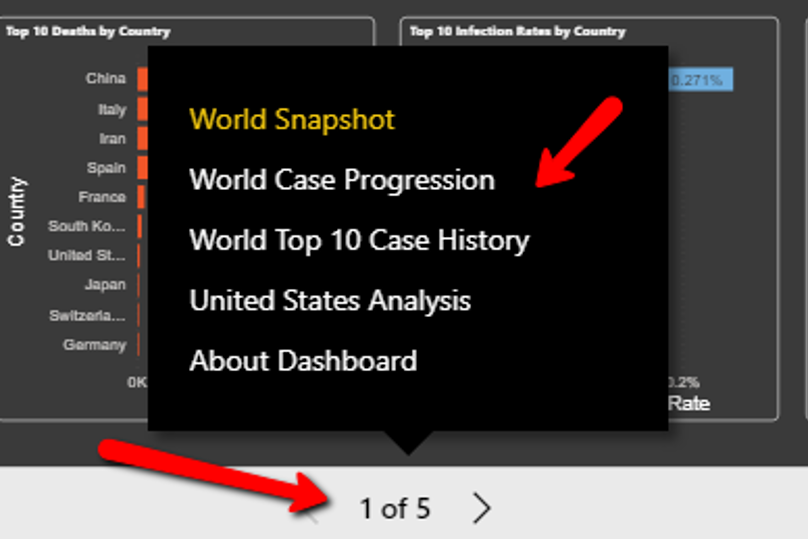
The dashboard is organized as a series of 5 pages including an information page that covers the sources for the data. In order to access the report in its full view, please follow these simple instructions:
To maximize the report view, click on the expand menu link highlighted below within the report to expand and experience the report in full-screen view.

To navigate between the different pages or tabs of the report, click on the navigation menu for a pop-up menu, or use the left and right arrows to navigate the report.
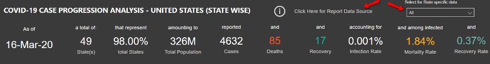
To select the view for a specific country or state of interest, select the drop-down list menu at the top right of the screen.
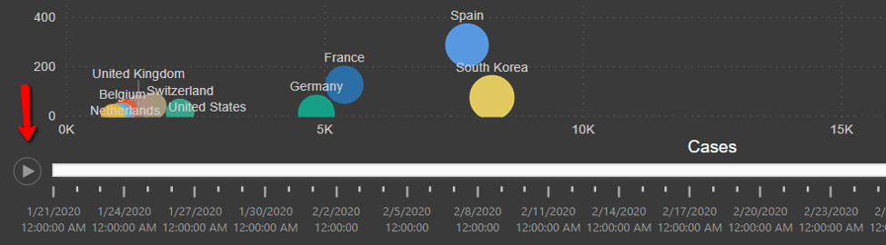
On the second report page or tab, look for the play axis control below to play and visualize the case progression over time.
To change filter group categories of geographies or select a specific country, click on the slicer menu at the top or use the drop-down to filter down to a specific country.

PLEASE SPREAD THE WORD
If you found this dashboard useful, please share to create awareness!